
Website design & build conducted in Q4 2019.
Brief: Consulting services included an extended material brand design system and website rebuild.
Marty Tenenbaum — Vice President, Business Development
Tom Ostojic — Medical Devices Regulatory Affairs Associate
John Boyack — Head of Point-of-care Diagnostics
The Trimedic Medical Supply Network required a website rebuild to resolve site errors and disruptions from multiple plugins and servers.
Medical Industry Professionals
Professional care, medical management
Wholesale &
varied pricing
Credibility, proficiency, trust
Website Performance
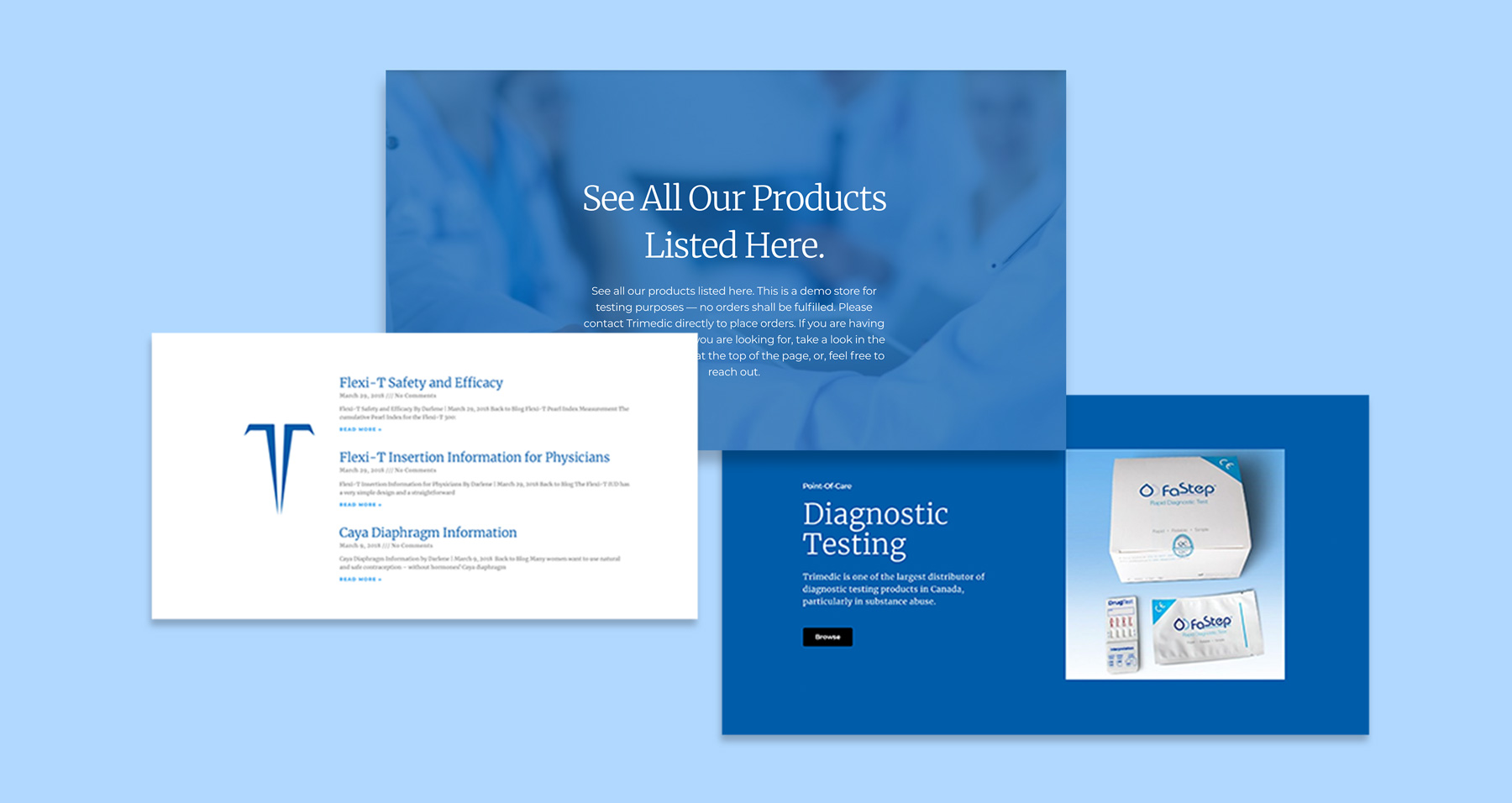
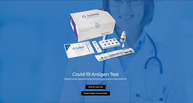
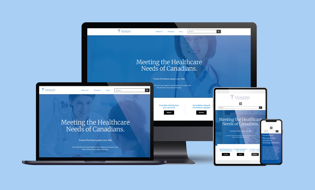
The Trimedic Supply Network is a known wholesale medical distributor based out of Concord, Ontario. With over 250 tools and instruments listed, the Supply Network meets the varied health demands of people across Canada. Trimedic was one of the few suppliers to receive Antigen testing kits during the early stages of the Covid-19 pandemic. The company required a more modern website rebuild to resolve issues regarding the online catalogue, navigation disorientation, and webpage loading delays.
Main Content
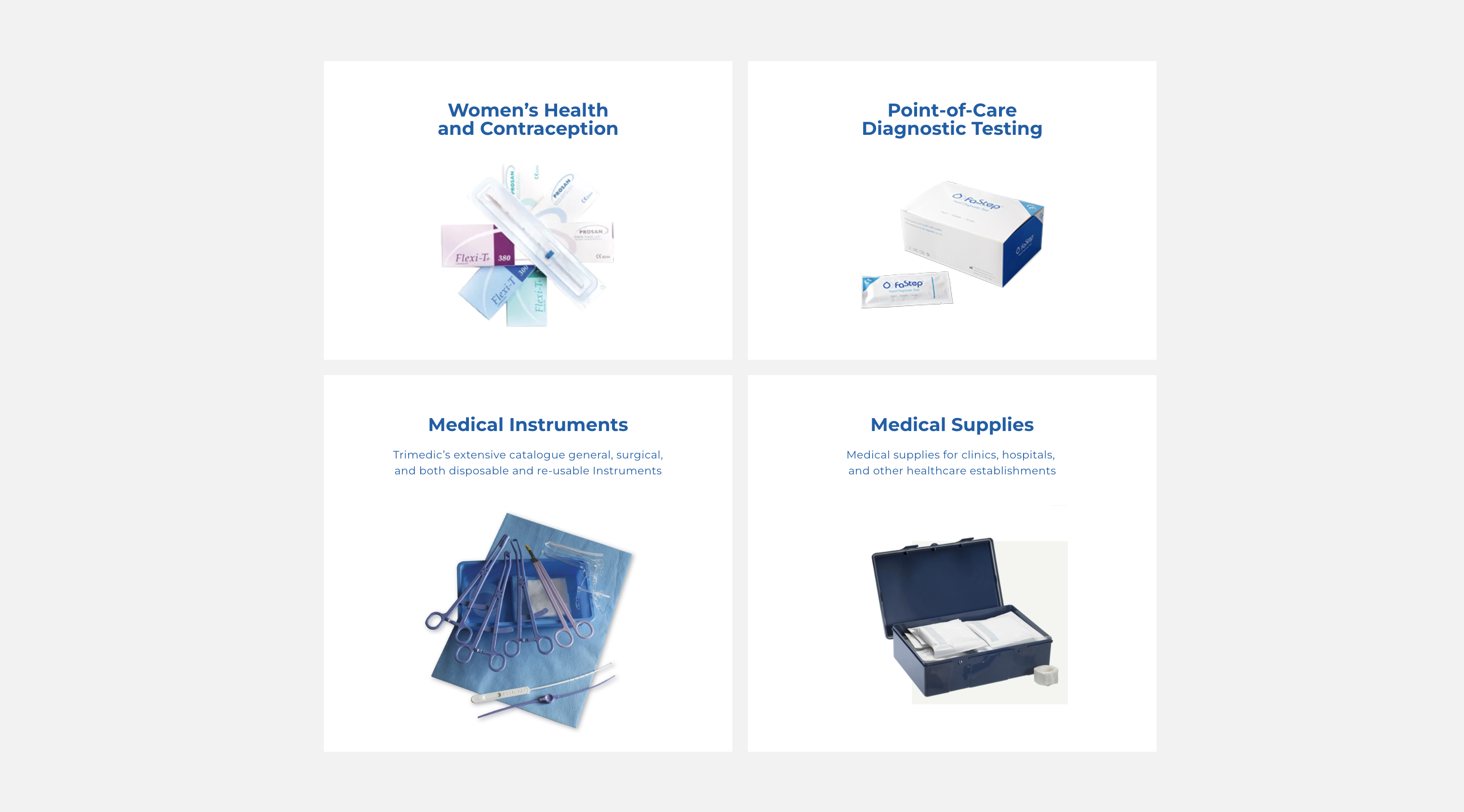
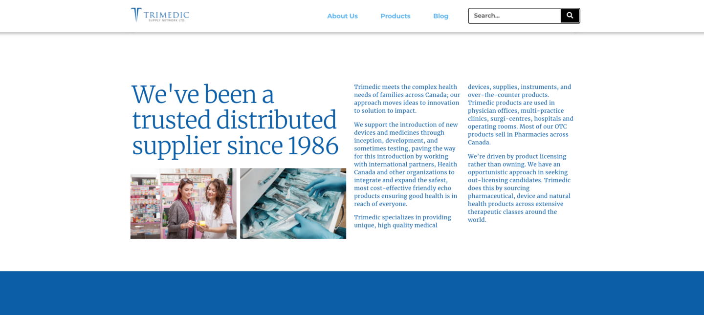
It was critical that the cornerstone content of the site referenced that Trimedic had been a medical supplier for 30+ years. The description also mentions that it has a presence with partners outside of Canada. Within the pharmaceutical, healthcare supply and therapeutic space, Trimedic also focuses on woman’s healthcare through ‘point-or-care testing’ and IUDs, etc. To best display this focus, woman working in healthcare are primarily displayed throughout the site. Blog articles also discuss contraceptive methods and non-hormonal kits in support of pro-choice practices and awareness.
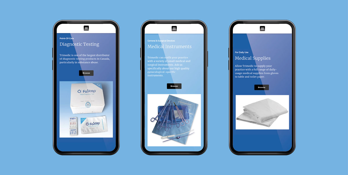
Mobile first
Although medical industry professionals were more commonly using desktop devices, mobile layouts were developed first. As medical suppliers were transitioning to more modern technological practises, the user interface needed to work with modern mobile layout standards. Web accessibility was a challenge with the former website build. These layout attributes were revisited during the rebuild.
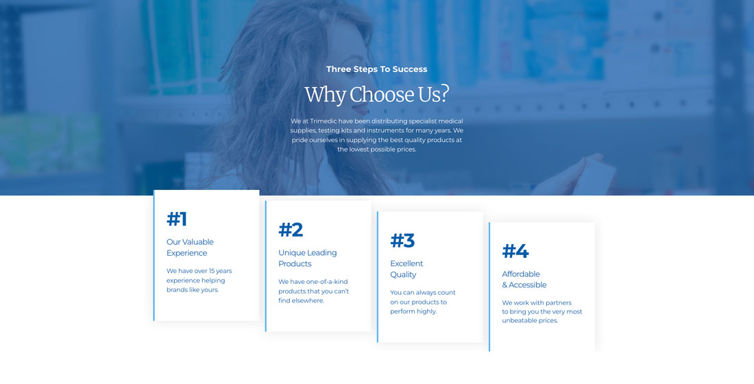
Sustaining value through design
The Trimedic Supply Network already had a national reputation. The goals of the design strategies were to clearly establish the company’s visual brand in more modern liking. Intentions also sought to make it easier for medical industry professionals to navigate the wide selection of products. Within the web UI it performed easier for professionals to find what they’re looking for. Brand attributes/ system, and more web accessible parameters helped to achieve this goal.
Product Navigation
The product library consisted of a considerable amount of products in a few different categories. It was no longer relevant to have a product filter as the quick search bar was used more frequently. The filters were also not ideal as the tended to slow down the site — when products were adjusted, the propagation time and site performance was insufficient. Less widgets and unnecessary attributes needed to be removed
Components
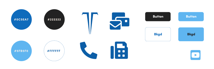
The web design rebuild included a material components library consisting of a colour palette with a lighter tint of the Trimedic blue. The former website build did not incorporate consistent chroma, typographical, and image parameters. Consistency of material design system are utilized across the site to further instil the credibility and reliability of Trimedic Inc.
Accessible UI
User actions needed to be web accessible. The previous version of the Trimedic website included all buttons and and interactions at a 100% #000000 (black) hue. Black has been determined to be a non-accessible colour over white in RGB colour space. With users already being familiar to this target hue, stakeholders of Trimedic were not inclined to change the colour in the new website build. The main button hue was attributed as close to black as possible.
Redundancy vs. Innovation
In hospitals, ‘blue’ (Code Blue) indicates cardiac arrest in a patient. Over the past 30 years, the average patient survival in a Code Blue scenario was 15%. Given the negative connotations of ‘blue’ in hospitals, the color blue wasn’t ideal to be the principal hue across the website rebuild initially. However, despite the unpleasant context around the color, blue is redundant in healthcare logos and branding as it signifies credibility, cleanliness, and professionalism. Project collaborators insisted that the Trimedic identity did not need to be ‘innovative’ as a medical supplier. Ultimately, instilling the health and wellness attributes of light blue as the dominant hue was necessary.
Conclusion
The Trimedic Supply Network continues to serve the medical industry nationwide and internationally through partnerships. In mid-2021, a human error and or web server error caused the Trimedic web database to disappear. It was very fortunate that a site backup was able to resolve the occurrence. Backups are crucial.
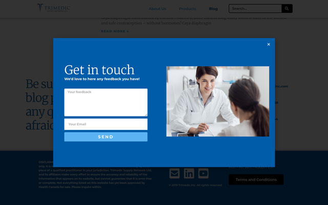
Reach out to us below for any inquiries. We look forward to learning about your business. Be in touch!