Overview
Project Scope
Web and identity design conducted in Q2 2021.
Brief: Consulting services included an extended visual brand identity solution and website build.
Collaborators
Melissa Robertson — Founder, Co-Owner and Ayurvedic Practitioner
Melissa Rochus — Co-Owner and and Ayurvedic Practitioner
Challenge
Rustic Room required a brand identity and website after its conception to grow its customer base within surrounding rural areas and metropolitan regions of Belmont, Ontario.
Target
Main clientele:
women aged 30-60
Attributes
Calmness,
warmth, energy
Values
Wellness, healing, meditation
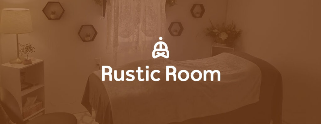
Rustic Room is a holistic healing service founded by Melissa Robertson in Belmont, Ontario. Treatments are guided by certified Ayurvedic practitioners with a background in yoga, nutrition and eastern medicine. A visual brand identity and website design solution was sought after the business was incorporated. It was of great importance that Rustic Room’s visual identity portray the values of Eastern holistic medicinal practices.
Demographic
Rustic Room tends to attract woman between the ages of 30 – 60 (Late millennials to Gen X). The main clientele resides within a 20 km radius of Belmont, ON.
Attributes of the front end design were tested among an MVP audience to keep the service aligned with clientele and stakeholders.
Style & Vision
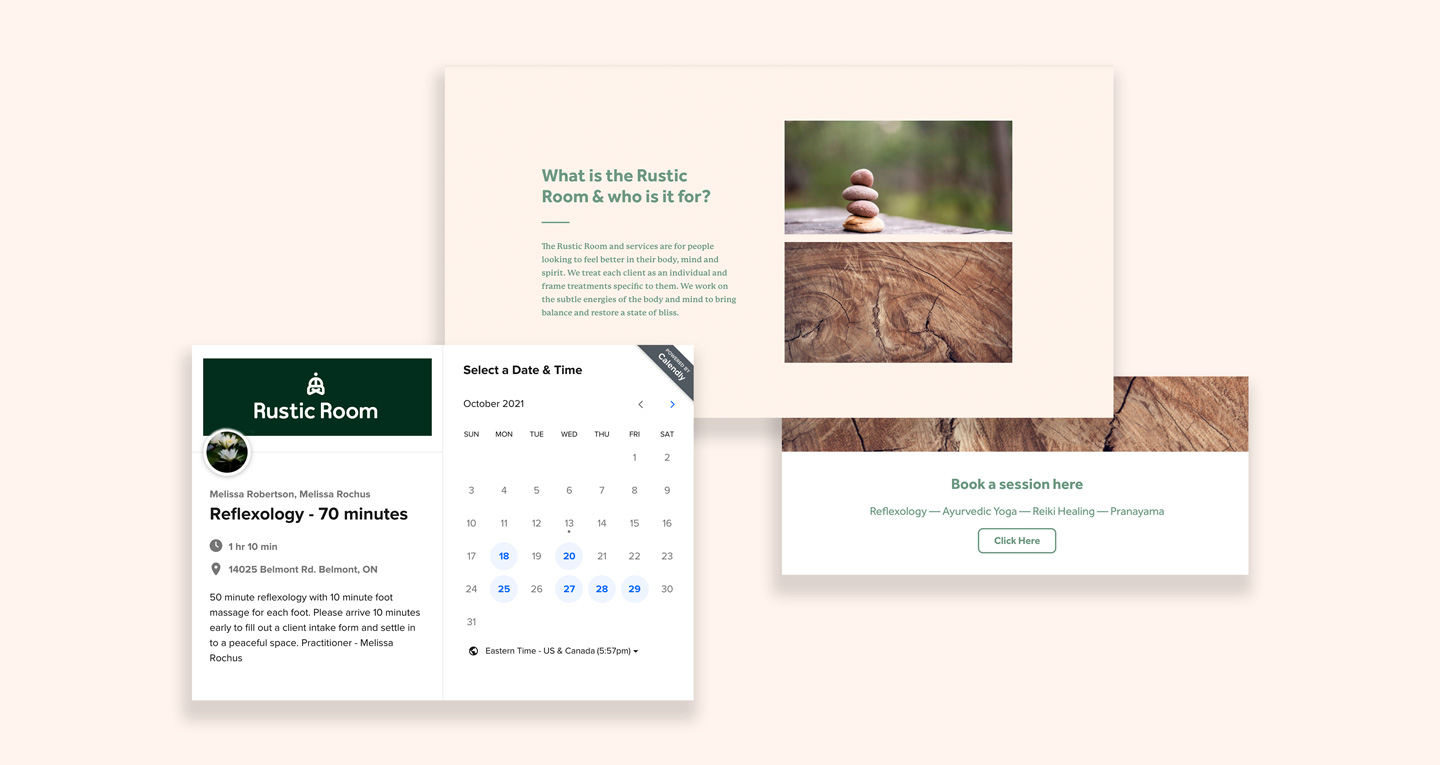
The purpose of the site was to schedule sessions online through a Calandly booking system. There is a blog to discuss Ayurvedic practices and the training involved. The Rustic Room vision and identity needed to encompass the denotive eminence of meditation, healing, and the natural outdoor setting of Belmont (the initial studio’s peaceful rural location).
Logo Design
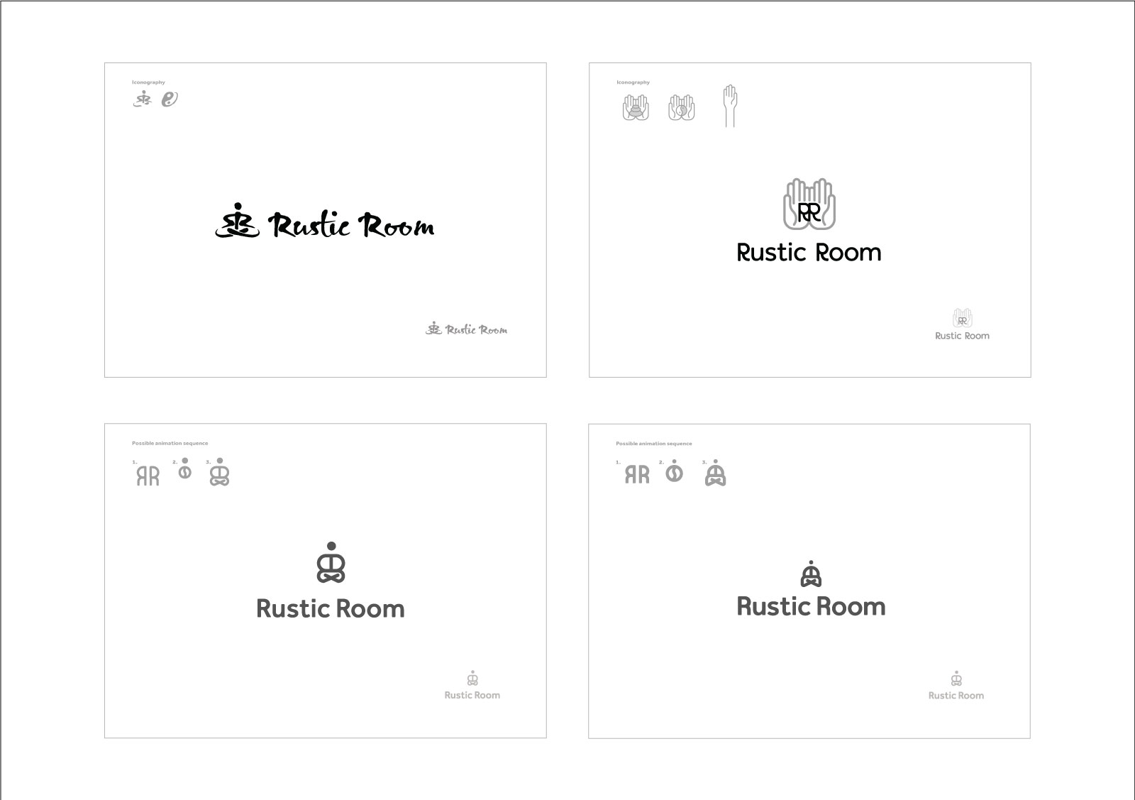
The establishing of a visual identity and system involved iterative proofs ranging from expressive to modern letter and stroke form.
The semi-final proofs (see above) included two different aesthetics: 1) Eastern calligraphic appropriating brushstrokes, and, 2) modern geometric configuration of shape at letter form. The latter option was chosen to be the signature as a better representation of the customer profile and sought demographic.
Tonal attributes
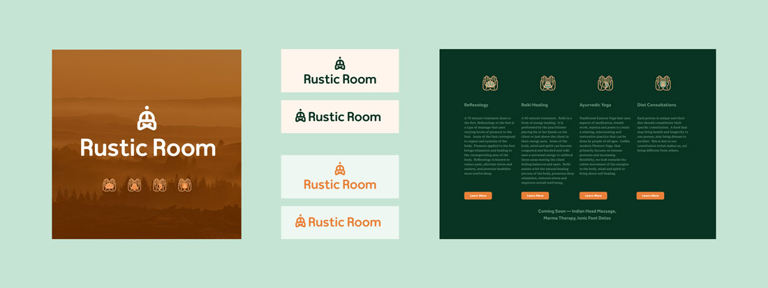
Iconography followed the modern geographic shape consisted in the logo design. It was important that the overlay of text to background was at least a 7:1 contrast ratio to meet web accessibility guidelines. This was adhered to in the print collateral as well, so that the depth in mood was assured. Colour treatment followed a complementary pellet throughout the user interface.
Landing Page
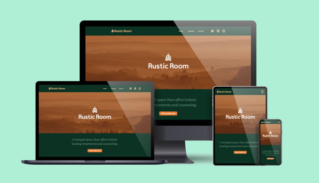
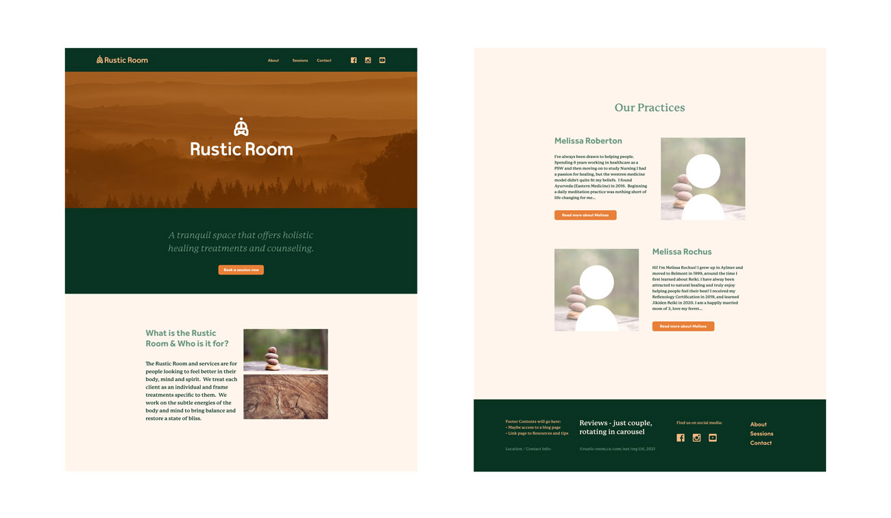
Above the fold, the founders were looking for Kris for warm tones to complement the brand values of calmness and eastern specialized wellness and medicinal practices.
The orange hue, inspired by turmeric and similar spices/seasonings are common in Ayurvedic practices and eastern originating diets. In contrast, the jade/ green hue is situated to portray a more earthy and vivid depth to the tonal harmony.
hands are commonly known to give expression, blessings and healing. Services are symbolized in the form of gentle hands containing each symbol in an animation sequence. The hands then fade near the end of the sequence and leave behind the emblematic icons of each service/ practice.
Launch
The website build included an online booking process to a calandly extension and general information on the services provided (through blog and and booking sections).
Conclusion
